
Visualize
This page introduces you to the visualizations supported by Axiom and some tips on how best to use them.
The visualizations explained on this page are only available for APL queries.
To visualize metrics data, see MPL language features.
count#
The count visualization counts all matching events and produces a time series chart.
Arguments#
This visualization doesn’t take an argument.
Group-by behaviour#
The visualization produces a separate result for each group plotted on a time series chart.
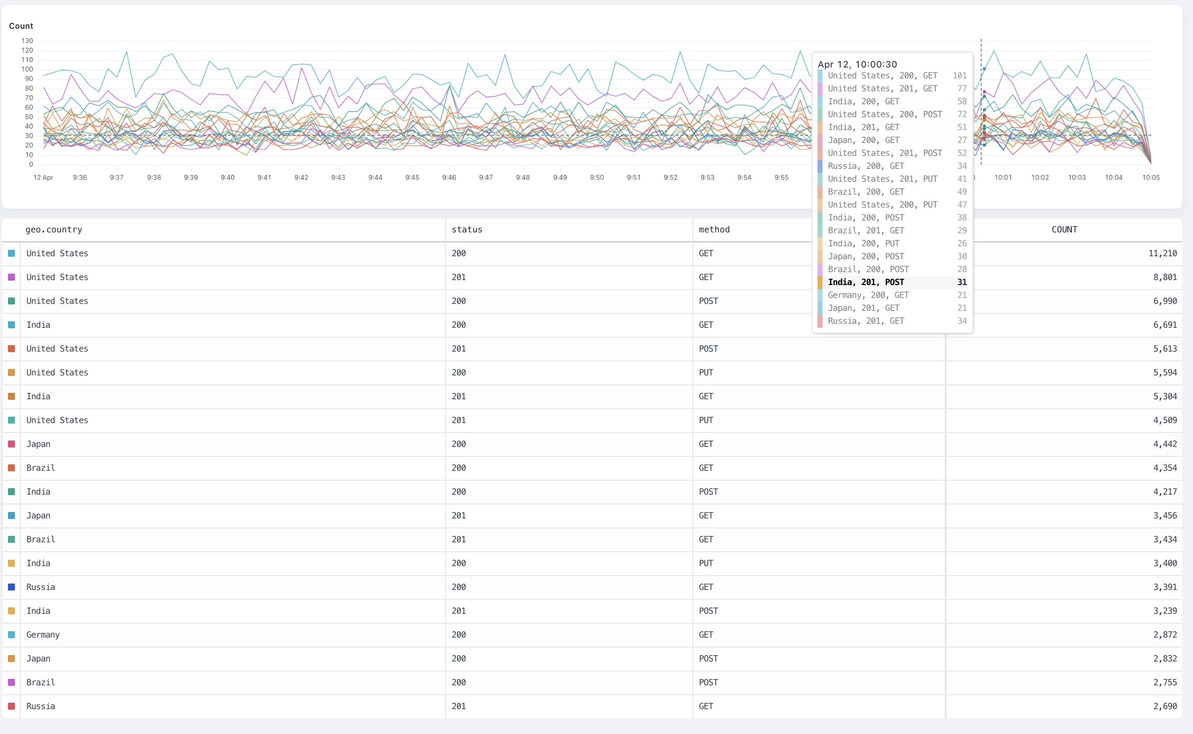
count overview
distinct#
The distinct visualization counts each distinct occurrence of the distinct field inside the dataset and produce a time series chart.
Arguments#
field: any is the field to aggregate.
Group-By Behaviour#
The visualization produces a separate result for each group plotted on a time series chart.
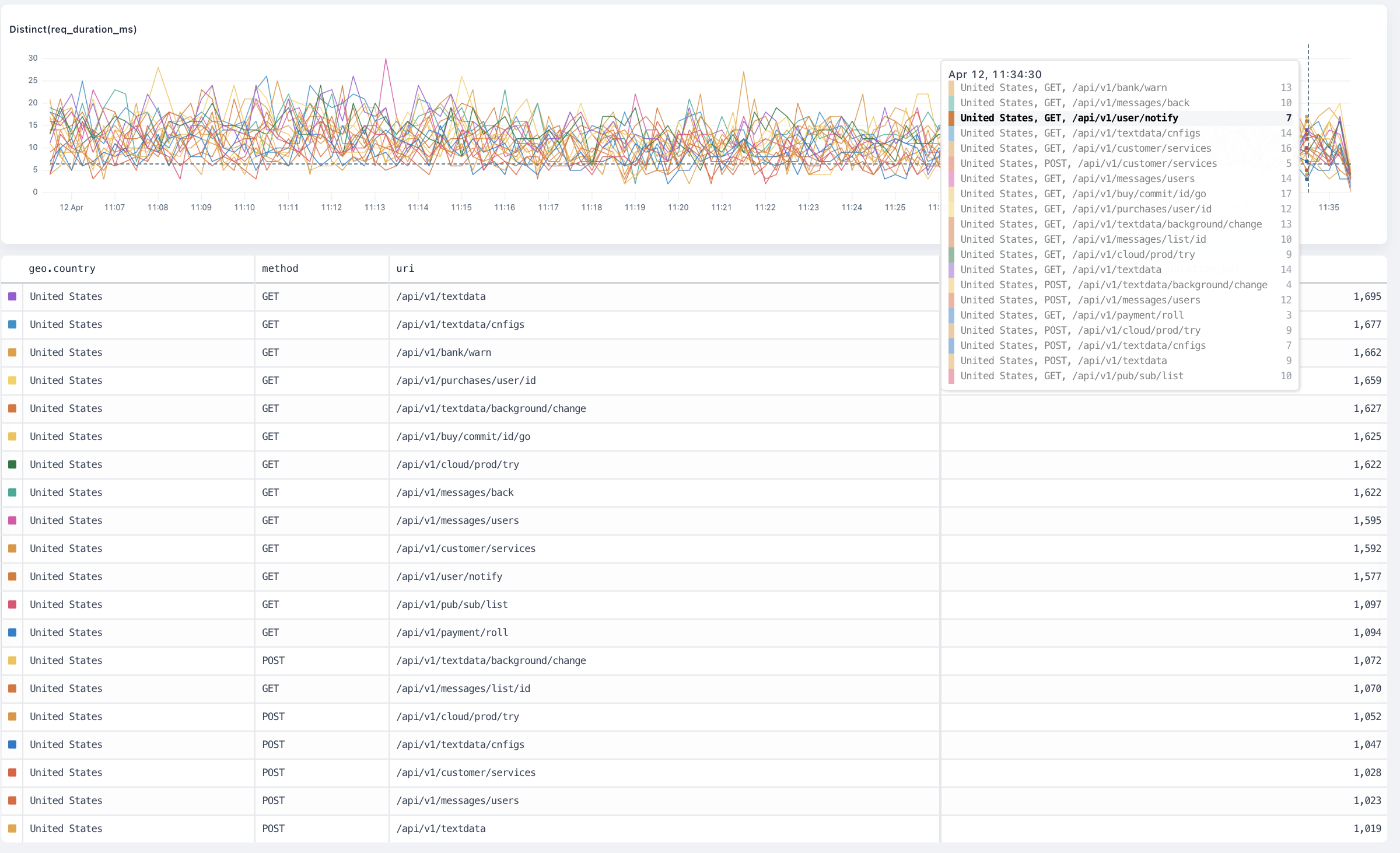
distinct overview
avg#
The avg visualization averages the values of the field inside the dataset and produces a time series chart.
Arguments#
field: number is the number field to average.
Group-by behaviour#
The visualization produces a separate result for each group plotted on a time series chart.
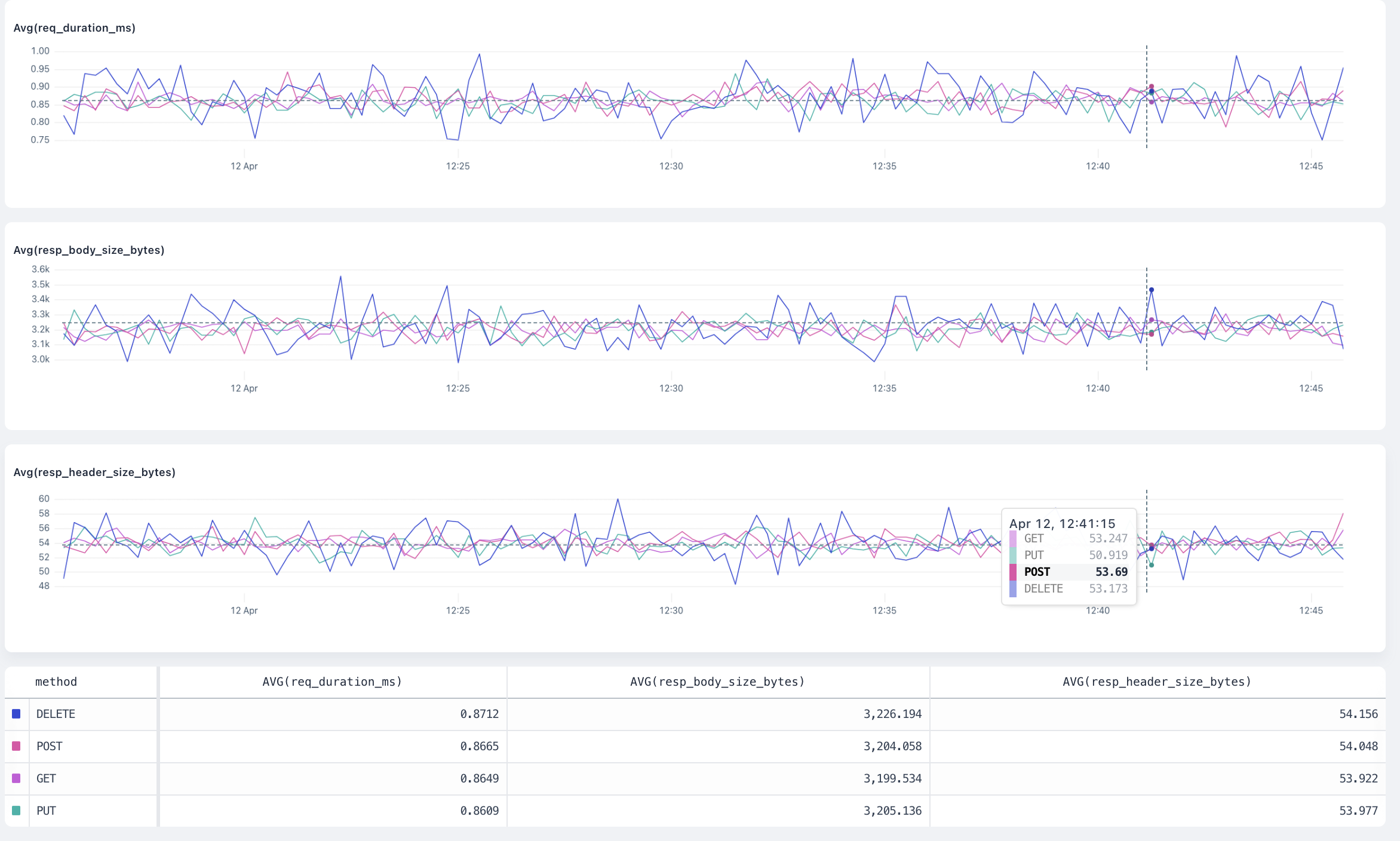
avg overview
max#
The max visualization finds the maximum value of the field inside the dataset and produces a time series chart.
Arguments#
field: number is the number field where Axiom finds the maximum value.
Group-by behaviour#
The visualization produces a separate result for each group plotted on a time series chart.
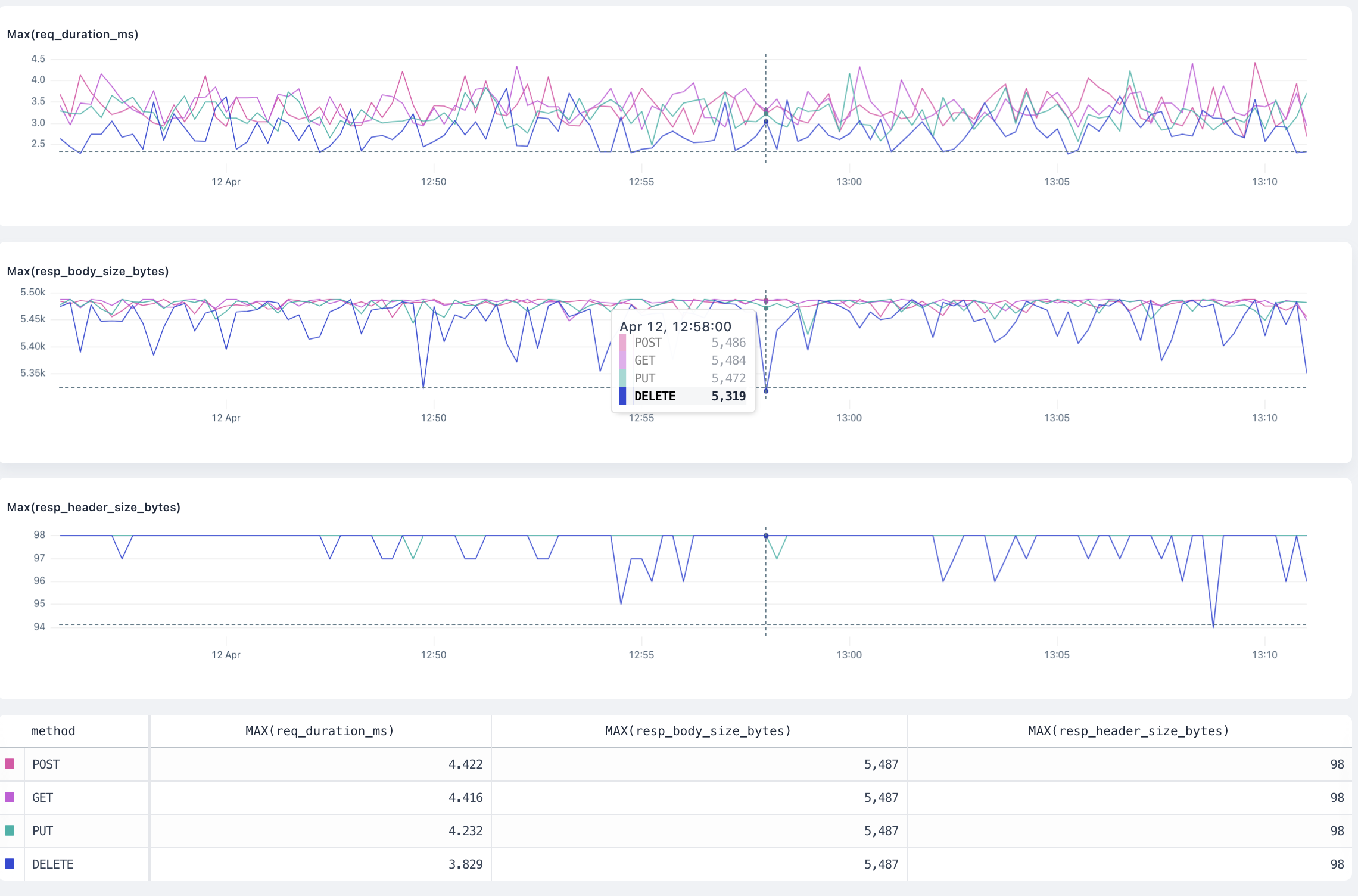
max overview
min#
The min visualization finds the minimum value of the field inside the dataset and produces a time series chart.
Arguments#
field: number is the number field where Axiom finds the minimum value.
Group-by behaviour#
The visualization produces a separate result for each group plotted on a time series chart.
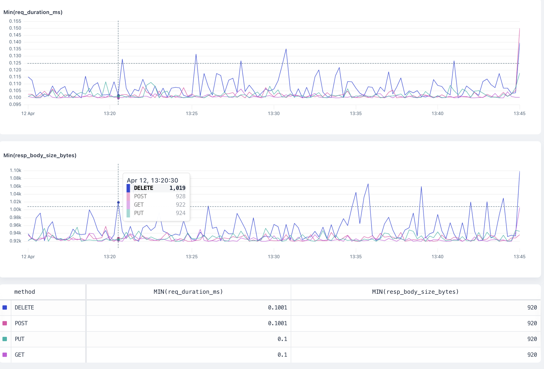
min overview
sum#
The sum visualization adds all the values of the field inside the dataset and produces a time series chart.
Arguments#
field: number is the number field where Axiom calculates the sum.
Group-by behaviour#
The visualization produces a separate result for each group plotted on a time series chart.
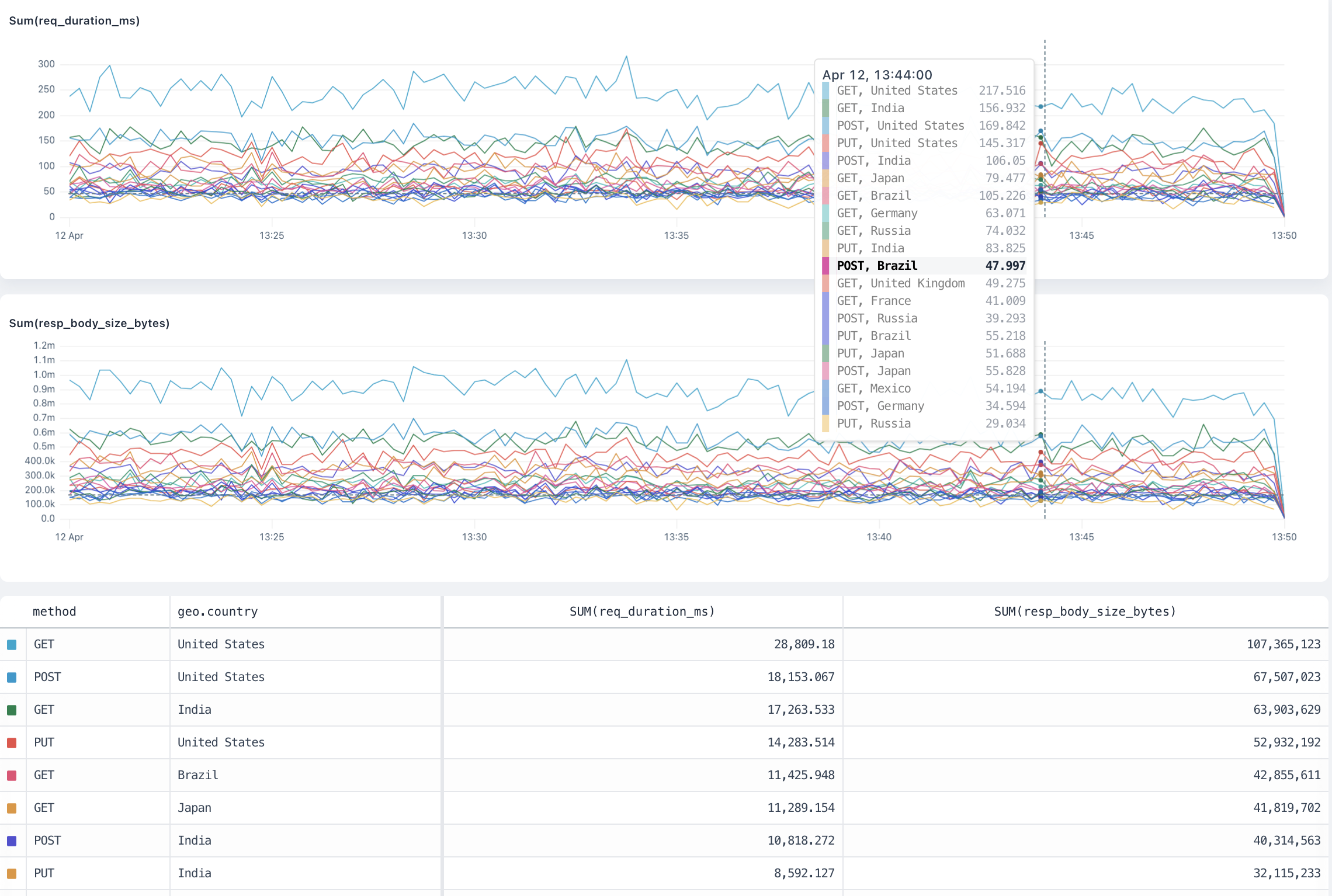
sum overview
percentiles#
The percentiles visualization calculates the requested percentiles of the field in the dataset and produces a time series chart.
Arguments#
field: numberis the number field where Axiom calculates the percentiles.percentiles: number [, ...]is a list of percentiles , each a float between 0 and 100. For example,percentiles(request_size, 95, 99, 99.9).
Group-by behaviour#
The visualization produces a separate result for each group plotted on a horizontal bar chart, allowing for visual comparison across the groups.
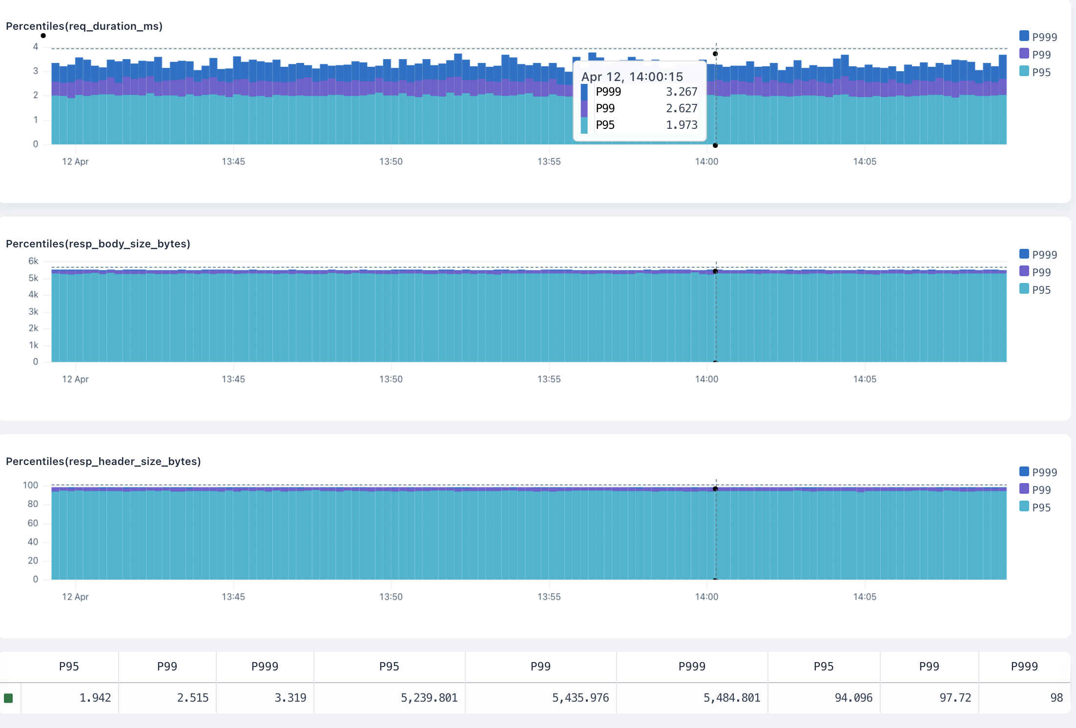
percentile overview
histogram#
The histogram visualization buckets the field into a distribution of N buckets, returning a time series heatmap chart.
Arguments#
field: numberis the number field where Axiom calculates the distribution.nBucketsis the number of buckets to return. For example,histogram(request_size, 15).
Group-by behaviour#
The visualization produces a separate result for each group plotted on a time series histogram. Hovering over a group in the totals table shows only the results for that group in the histogram.
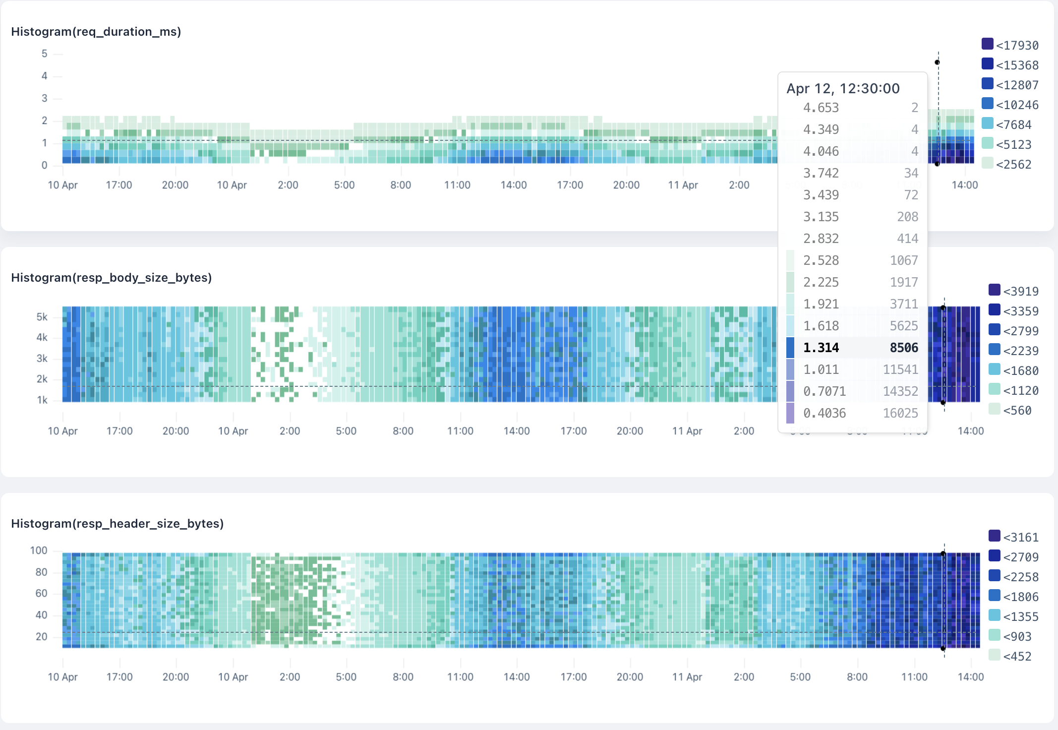
histogram overview
topk#
The topk visualization calculates the top values for a field in a dataset.
Arguments#
field: numberis the number field where Axiom calculates the top values.nResultsis the number of top values to return. For example,topk(method, 10).
Group-by behaviour#
The visualization produces a separate result for each group plotted on a time series chart.
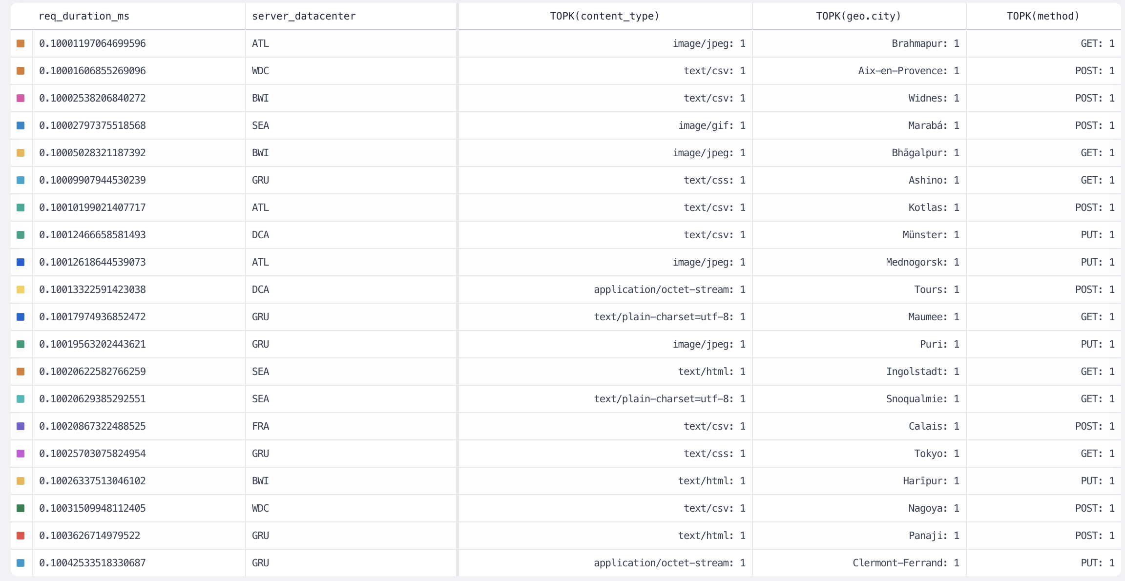
topk overview
variance#
The variance visualization calculates the variance of the field in the dataset and produces a time series chart.
The variance aggregation returns the sample variance of the fields of the dataset.
Arguments#
field: number is the number field where Axiom calculates the variance.
Group-by behaviour#
The visualization produces a separate result for each group plotted on a time series chart.
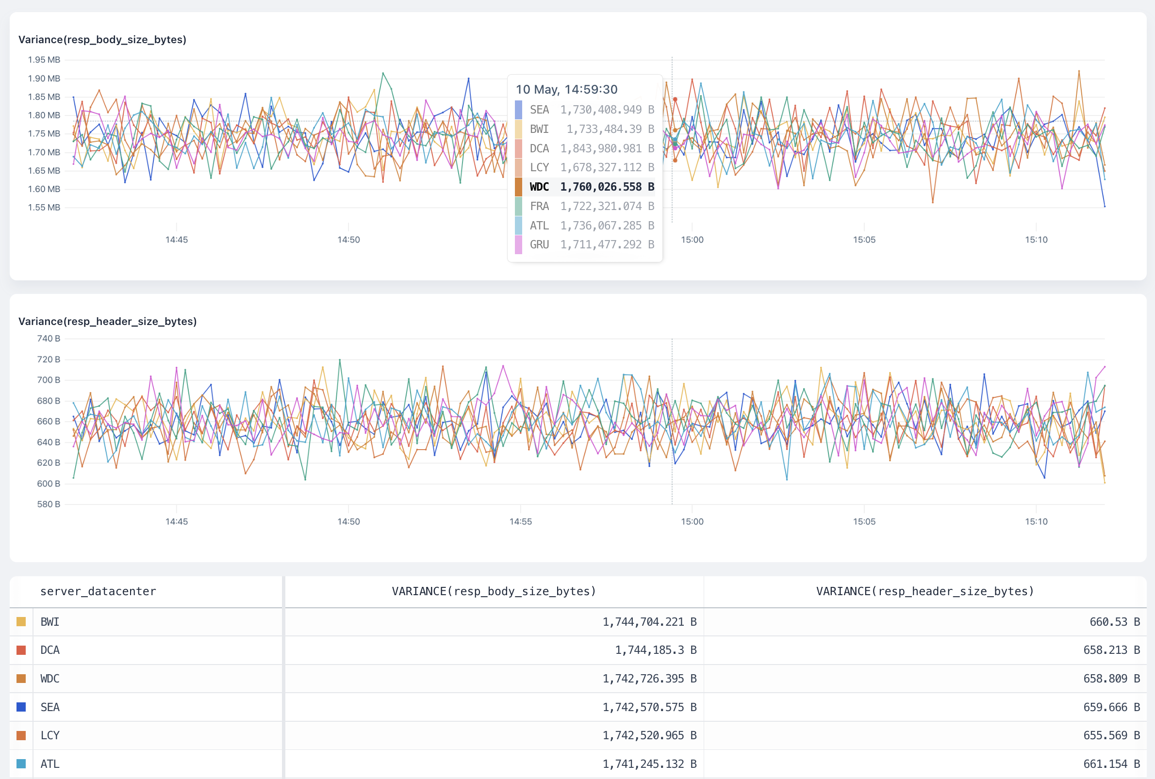
variance overview
stddev#
The stddev visualization calculates the standard deviation of the field in the dataset and produces a time series chart.
The stddev aggregation returns the sample standard deviation of the fields of the dataset.
Arguments#
field: number is the number field where Axiom calculates the standard deviation.
Group-by behaviour#
The visualization produces a separate result for each group plotted on a time series chart.
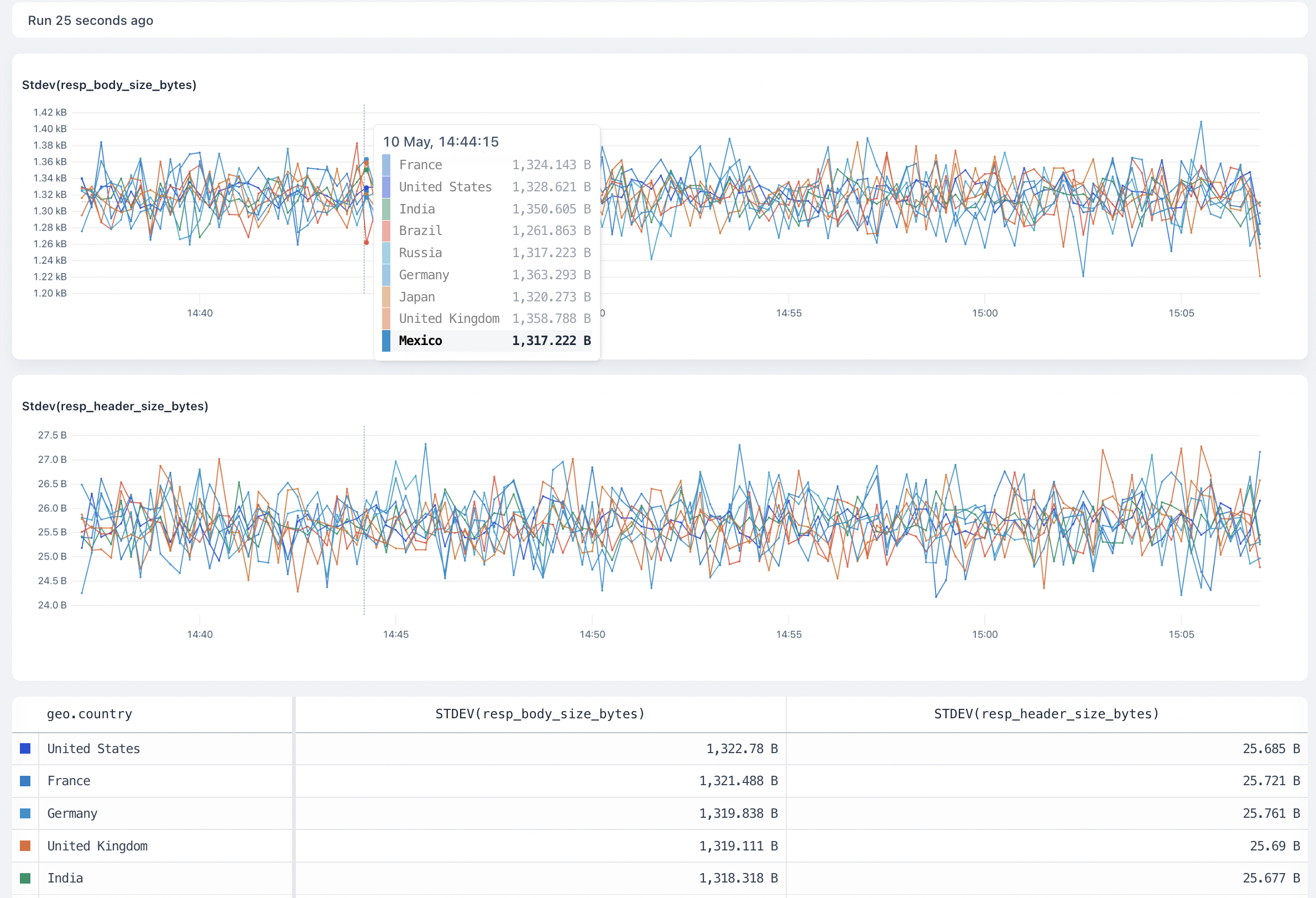
stddev overview