Scatter plot
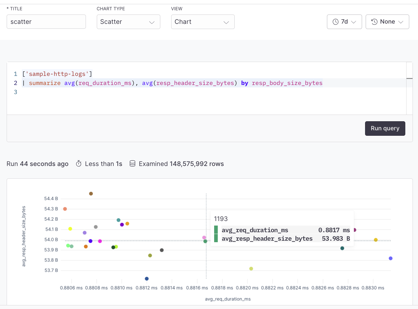
For example, plot response size against response time for an API to see if larger responses are correlated with slower response times.
Prerequisites#
- Create an Axiom account.
- Create a dataset in Axiom where you send your data.
- Send data to your Axiom dataset.
- Create an empty dashboard.
Create a dashboard element#
- Go to the Dashboards tab and open the dashboard to which you want to add the scatter plot.
- Click Edit dashboard.
- Click Add element in the top right corner.
- Click Scatter from the list.
- Choose one of the following:
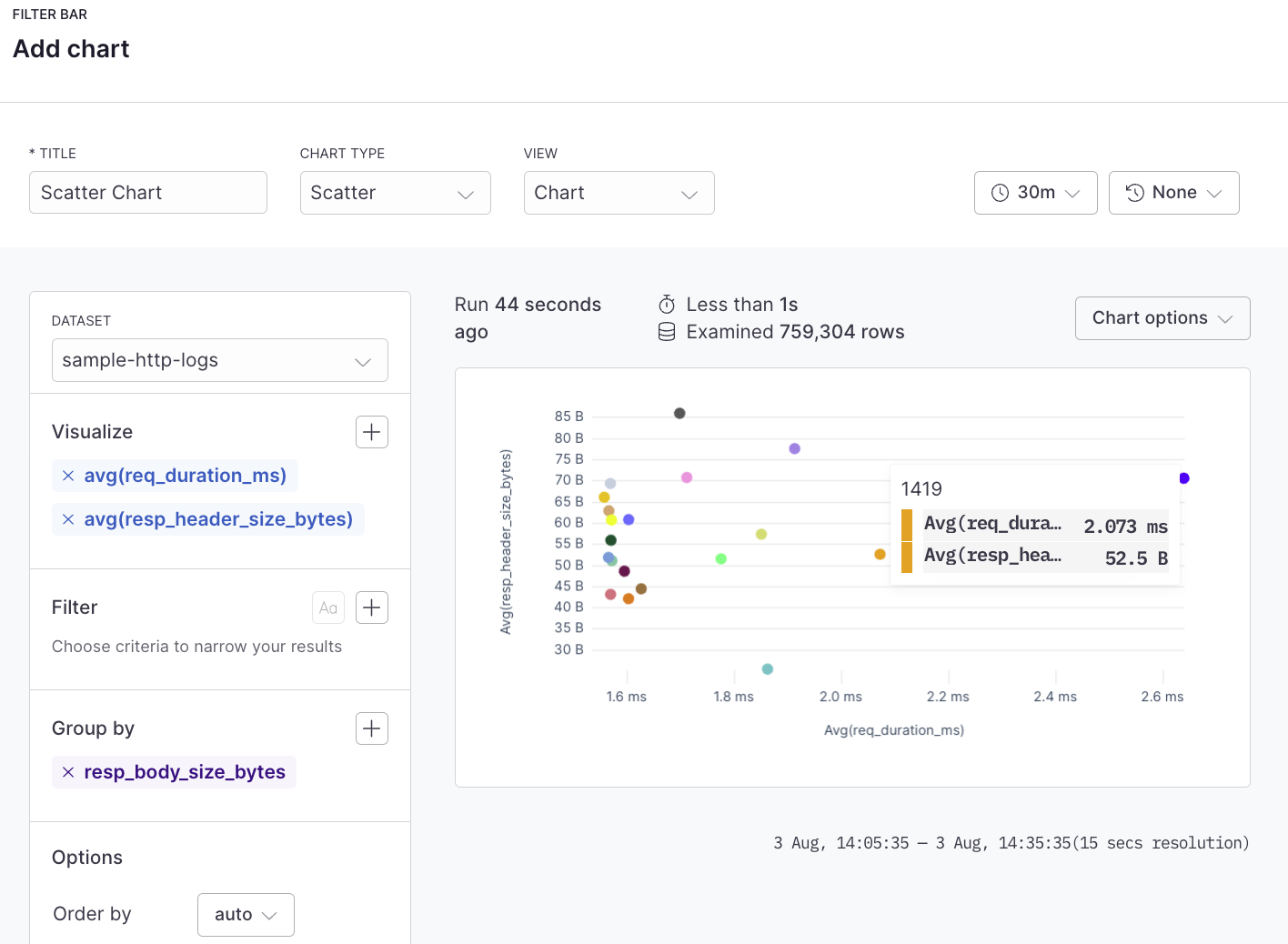
- Click Builder to create your chart using a visual query builder. For more information, see Create chart using visual query builder.
- Click APL to create your chart using the Axiom Processing Language (APL). Create a chart in the same way you create a chart in the Editor of the Query tab.
- Optional: Configure the dashboard element.
- Click Save.
The new element appears in your dashboard. At the bottom, click Save to save your changes to the dashboard.
Example with Builder#
Example with APL#
['sample-http-logs']
| summarize avg(req_duration_ms), avg(resp_header_size_bytes) by resp_body_size_bytes